.png)


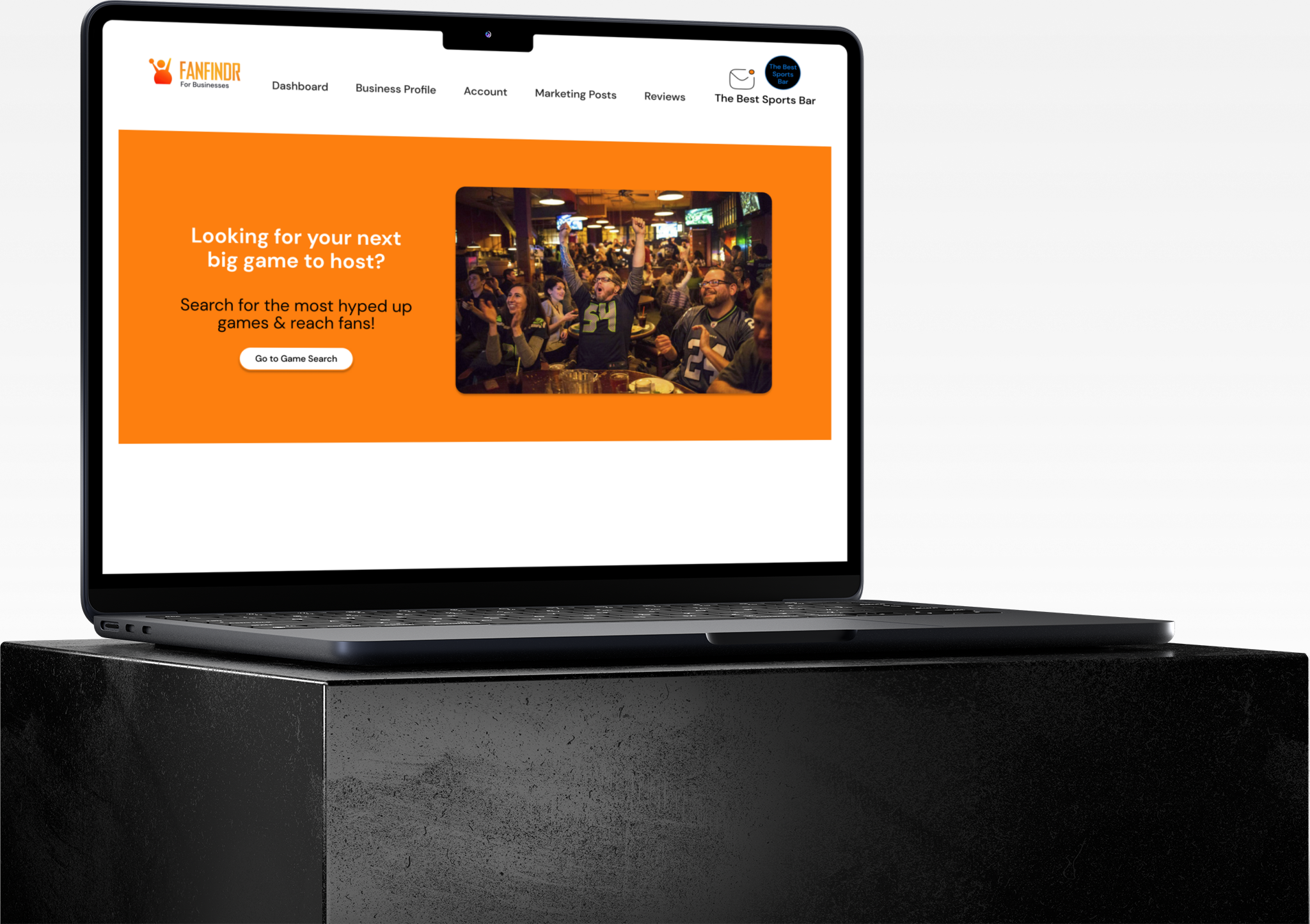
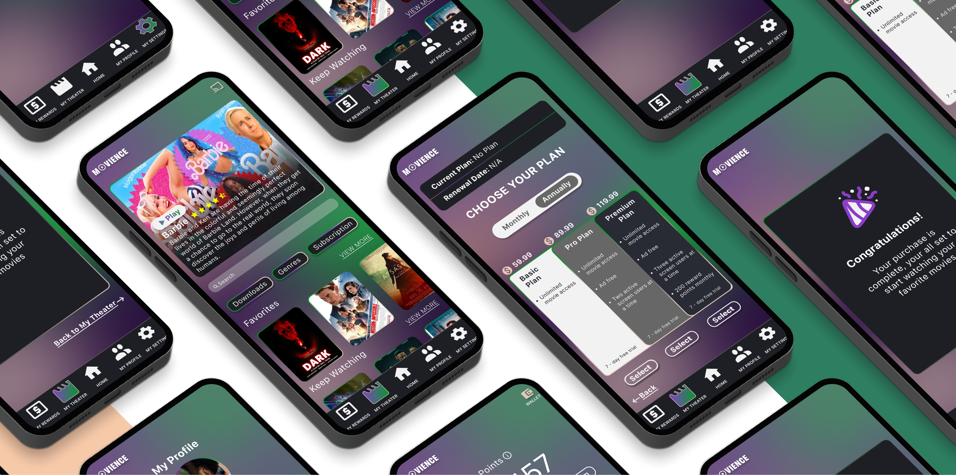
Movience
2023 - A mobile base app that merges concerns from end users and stakeholders to combine for a great experience for end users while keeping stakeholders in mind. Tools: Figma, Miro, Marvel App
Are theaters losing their place?
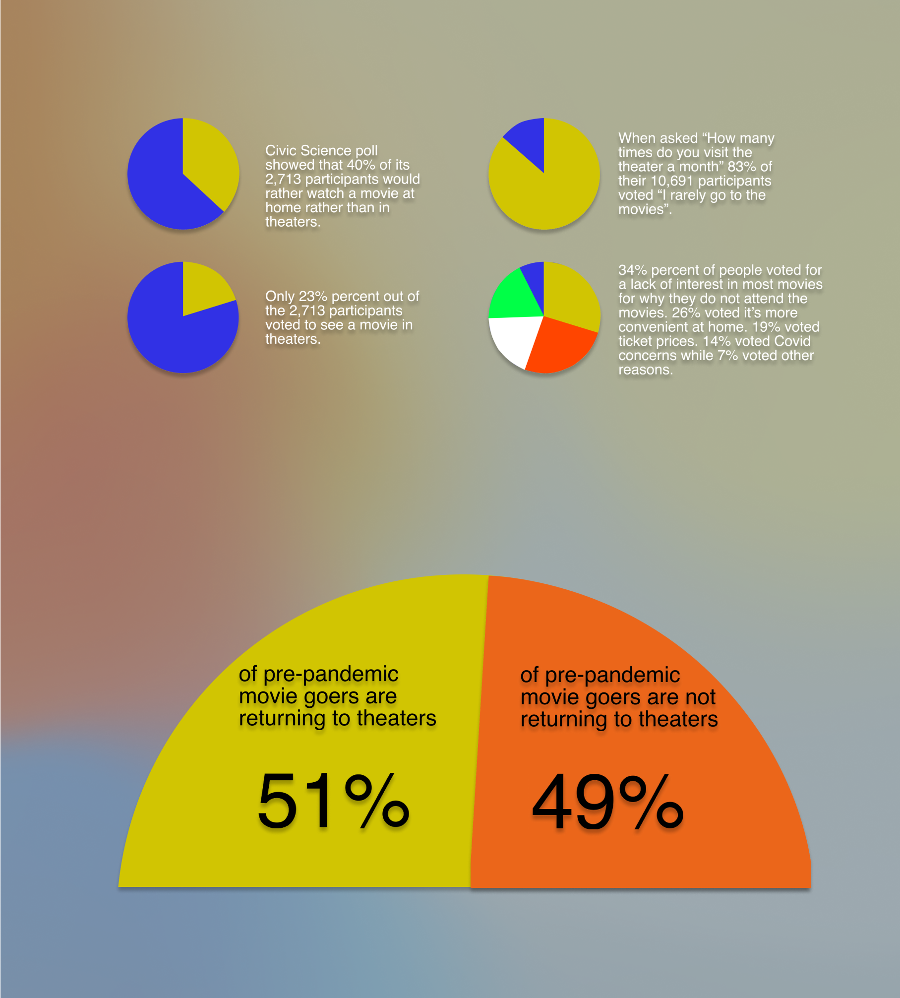
Theaters around the United States have seen a huge decline in attendance, alongside sales in concessions. With streaming platforms such as Netflix, Hulu, Disney plus, giving users the ability to enjoy their favorite shows in the comfort of their ownhomes. Regaining a presence which was once packed theaters has proven to be a difficult task.
Wait! I think I got it!
- How can I get people back in theaters?
- How can I improve the theater experience?
- How can I keep theaters in competition with popular streaming platforms?
- How can my product be beneficial to my users and stakeholders?
All of these were questions that came to mind when considering a solution to the problem. After a few exercises it finally came to me. A subscriptions base streaming service specifically for theaters! A platform where users can watch movies conveniently in their own home, while also being incentivized
Process behind the solution
This streaming platform would give users the convenient option to watch their favorite movies in the comfort of their own home because of interruptions and distractions that are inevitable within theaters, while theaters still receive profits from subscription sales and users are still incentivized by deals and discounts just from watching movies.
My role as designer
- Performing qualitative, quantitative, primary, and secondary research.
- Synthesizing research and data.
- Perform a multitude of user interviews.
- Create and present ideations, user flows, wire frames, low/high fidelity screens, sketches, prototyping
Screener survey data / User interview transcripts
To find the right participants for my interviews I created a Google questionnaire that would ask important questions that would point me in the direction of who my target audience were. After selecting the five participants who I thought best fit my criteria, I created an interview guide that gave me the opportunity to ask them what they thought about the typical movie theater experience alongside what they liked and disliked.
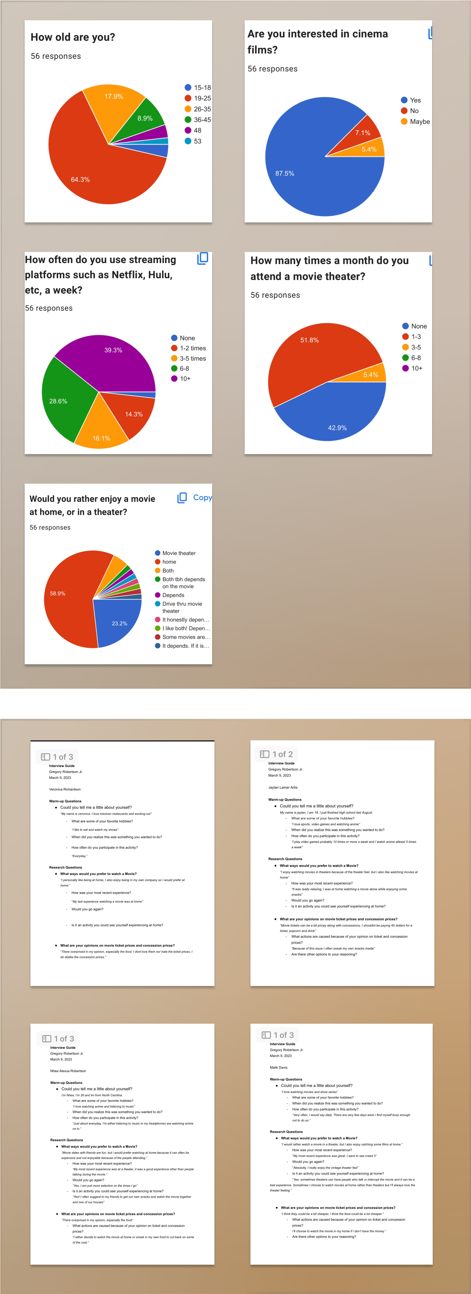
Key takeaways
- Clear dislike in regards with ticket/concession prices
- Interruptions in theaters is a concern
- Customers want loyalty shown from theaters
- There is a large circle of people who would prefer to watch movies at home
- Convenience is a big concern from customers
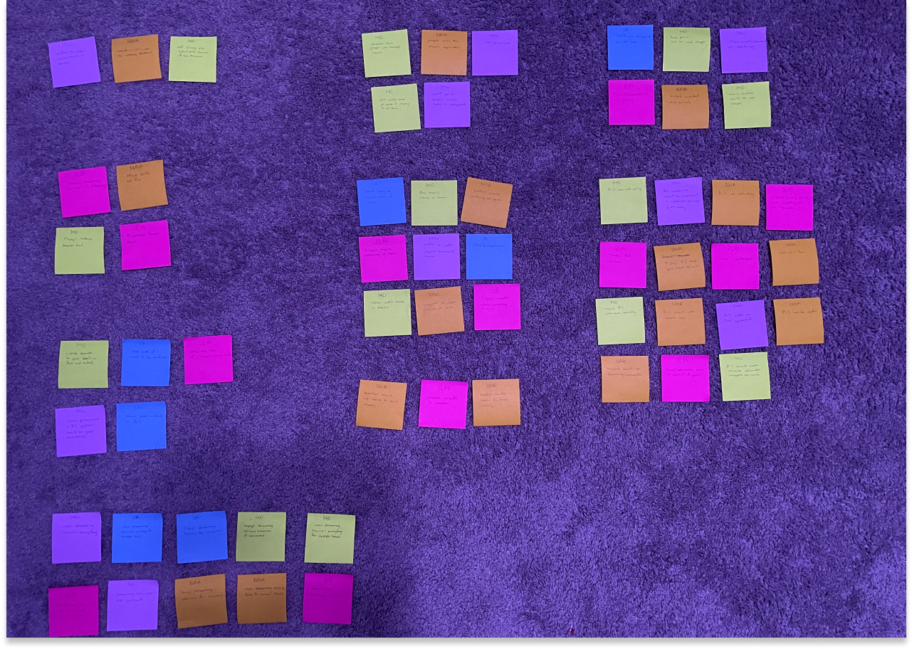
Synthesizing research
Now that I have obtained the necessary information and data about my topic, I began to move on to synthesizing my research within different methods to accurately pin point pros, pain points, what it is users and customers really want, and new issues from topics that may have arrived that we didn’t begin with.
Affinity mapping
I began my affinity mapping with taking sticky notes and writing down all of the comments I received from my participants during the screener survey. My next step was to group similar comments together which would provide me with important answers to questions such as, “Where do most of the con's / pro’s stem from?”, “What do some of these comments have in common?”, “Are there new topics that formed that we previously didn’t obtained from past research and data?”
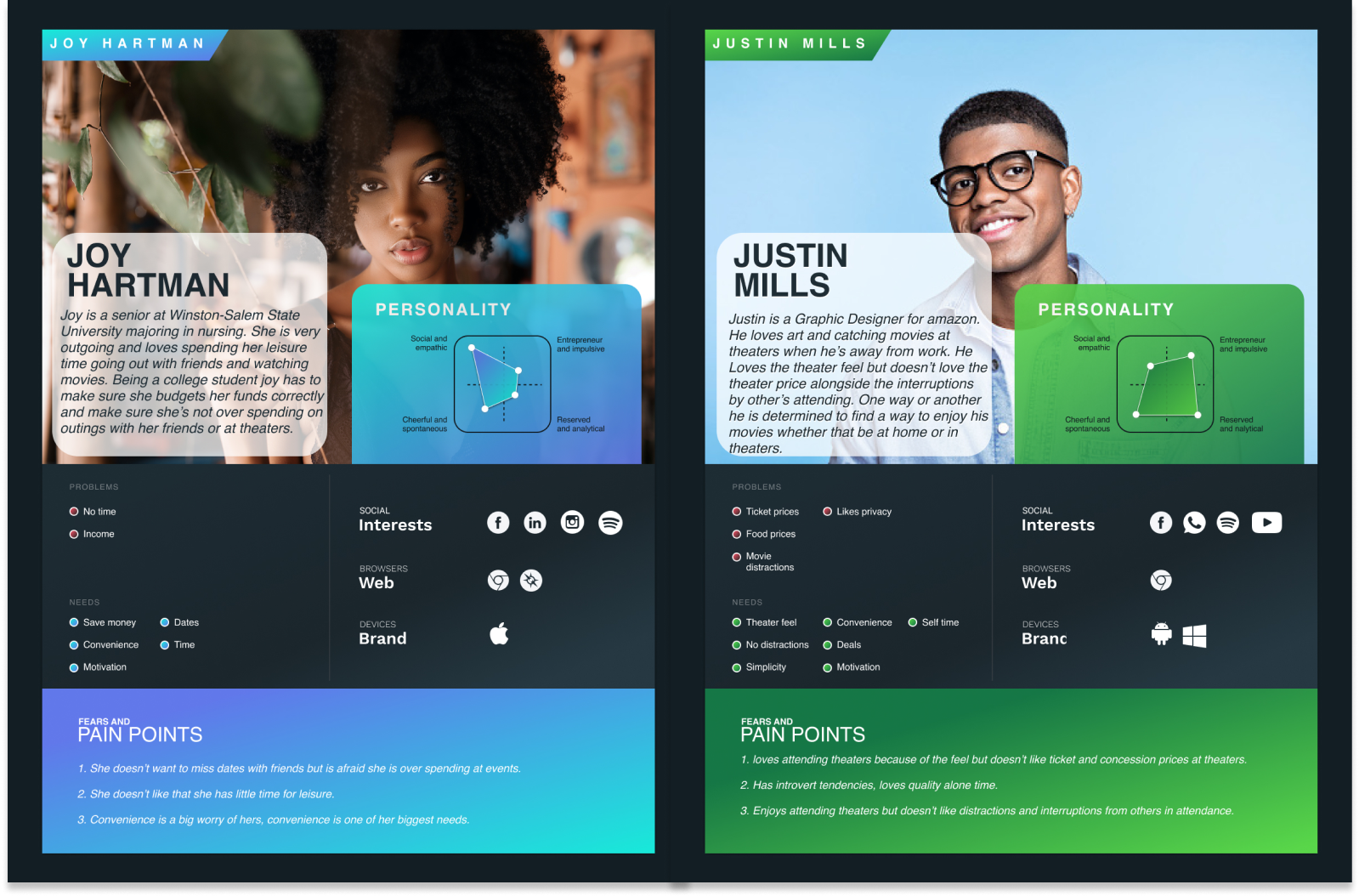
User personas
With the knowledge obtained from my affinity mapping, and think/feel vs say/do, It was time to create some user personas. These two personas specifically target major needs and pain points from the users stand point and will allow stakeholders to accurately see what is it that their target audience is looking for when it comes to a product or service.
How might we statments
Before moving on to the design side for this project, it was time to come up with a few “how might we” statements. After going through our design research process, these statements are the final pivotal questions I needed to ask myself if I wanted to create a product that would my target audience would genuinely love and enjoy.

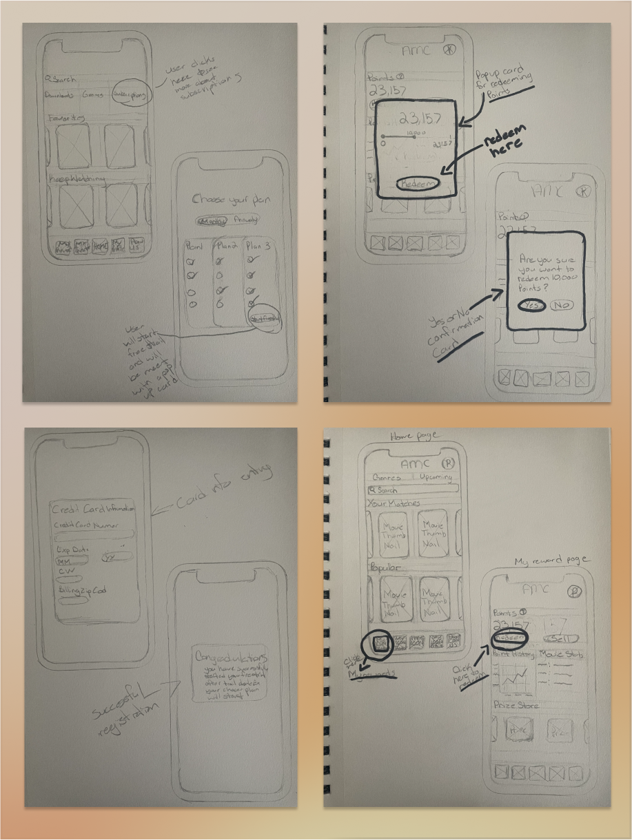
Early sketch ideations
Below are some early sketches of interfaces for my streaming platform. these sketches include placeholders, key notes and overall a general idea on how I envisioned some of my high-fidelity screens to look like.
Sitemap
It was important in this process to start to get an idea on how I wanted the layout and navigation to look like when transitioning through the application. Here is an early layout on the applications main and sub screens alongside additional pages within those screens.

User flows
Once I had a strong foundation on what I wanted my interfaces to look like, I started to come up with my red routes for my application and build a user flow chart for both of my user personas.

Low fidelity wire frames
Now that I have my sitemap to reference, alongside my early sketch ideations I was ready to begin the creation of my low fidelity wire frames.
Usability Testing
With my low fidelity screens completed, I start to conduct some usability testing. I set up a chart that displays my participants, their age, and their hobbies. I collected their feedback in a style of an affinity map while color coding the feedback to show what issues were of main priority.
High fidelity wire frames / Prototype
After receiving all of my insights from usability testing, I went back to the drawing board to reiterate and improve on some of the issues that I received. I began the design of my official high fidelity screens for the application.